Quiet Type
By SF/Arts Editors
Letterform Archive Outlines 100 Years of Bauhaus Typography
A little more than a hundred years ago, German architect Walter Gropius, founder of the Bauhaus, had a vision to unite art and design into a single creative expression.
Much of what we recognize as modern design and architecture today came out of the short-lived school that only existed for 14 years. Among its several disciplines and legacies Bauhaus typography looms large as a major influence in today's design.
The newly opened Letterform Archive gallery, a small but cleverly custom-designed space in San Francisco's Dogpatch district, is dedicated to showcasing a permanent collection of Bauhaus material, dating from 1919 to 1933. Selected by curators Rob Saunders and Henry Cole Smith, the result is a focused and fascinating look at early Bauhaus design through a clear curatorial lens. There are more than 150 pieces in the collection which includes books, catalogues, magazines, a stunning collection of postcards, and, of course, graphic design by greats such as László Moholy-Nagy, Paul Klee, Wassily Kandinsky, and Johannes Itten.
Bold utilitarian sans-serif typefaces, asymmetrical layouts, experimental alphabets, and photomontages dominate. There's even a Gujarati Type Foundry 1937 Specimen Book from one of India's leading metal type manufacturers.
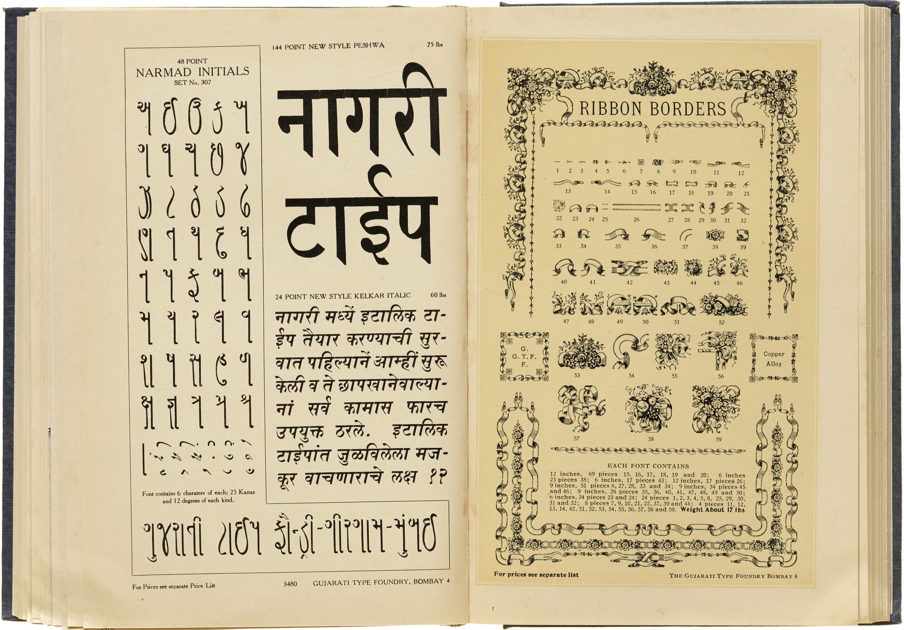
The Book of Typefaces and Printers’ Auxiliaries, Gujarati Type Foundry, ca. 1937, showcasing display weights for Gujarati and Devanagari in upright styles as well as a slanted italic style. Image courtesy Letterform Archive.
“We’re excited to share the Archive’s Bauhaus collection, which focuses as much on the earlier, more expressive work as on the better known new typography style,” says Curator Rob Saunders. “We’re also really thrilled to unveil our first gallery, with its custom modular panels and vitrines designed to flexibly adapt to a broad range of upcoming exhibits.”
According to Saunders, Letterform is a go-to place for researchers from the likes of Adobe and top-level typography producers.

Zai Divechi "Quiet Type." Image courtesy of the artist and Letterform Archive.
"Bauhaus Typography at 100" draws a throughline from the Bauhaus’s iconic style to the shape of typography today. A contemporary exhibit featuring the work of artist Zai Divechi demonstrates that reach and breath of type art. "Quiet Type" is Divecha's sculptural installation of 26 letters and 10 numbers celebrating the art of the character. She originally created the work for "36 Days of Type," a global social media creative challenge where designers submit a daily letter or number design for 36 days, and emerged a winner. It was Adobe’s first year joining as a partner to the event, creating what is now an international contest.
In addition to housing Bauhaus and other collections, the Letterform Archive has a bright space where workshops and classes are held. So who wants to design their own typeface? At Letterform you can sign up for a 10-week course or a more intensive year-long certificate program in type design.
→ more information at letterformarchive.org
Main image, courtesy Letterform Archive.
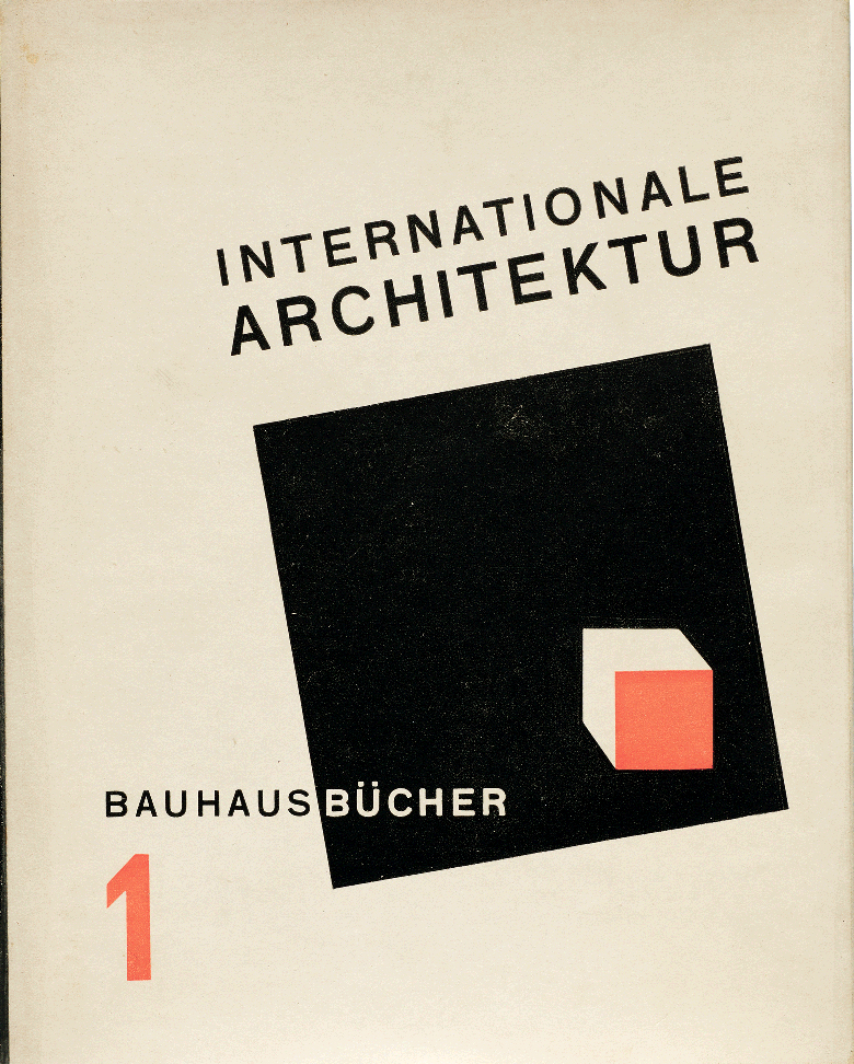
1925
Farkas Molnár (jacket designer) László Moholy-Nagy (layout designer)
International Architecture (Internationale Architektur), Bauhaus Book 1